Building a robust website is no small task. Countless articles have been written about pieces of the end-to-end process: the initial stages of ideation and user research activities that define what could be built; the myriad of design-centric artifacts that define what will be built and how users will interact with it; and the engineering processes that define how it will come to life. When working in cross-discipline teams, it should all flow naturally from one team to another to a finished product.
That all sounds very “waterfall” doesn’t it?
The design and development process is often more iterative, with adjustments coming from all directions as we discover new things about our users or our platform. Engineers and designers should therefore speak a common language when creating artifacts that are meant to guide product development. For this article, we’ll focus on how you can take a commonly used design tool called a “sitemap” and add engineering context, while keeping it understandable to all parties involved (even outside of those two groups).
Site Maps 101
Let’s build up a sitemap by thinking of ourselves as a musician building a personal app to manage his music. Jeff Cardelo gives a great one-sentence description of sitemaps:
“A sitemap provides a diagram of the site’s hierarchy and shows where each page fits into this hierarchy,” (webflow).
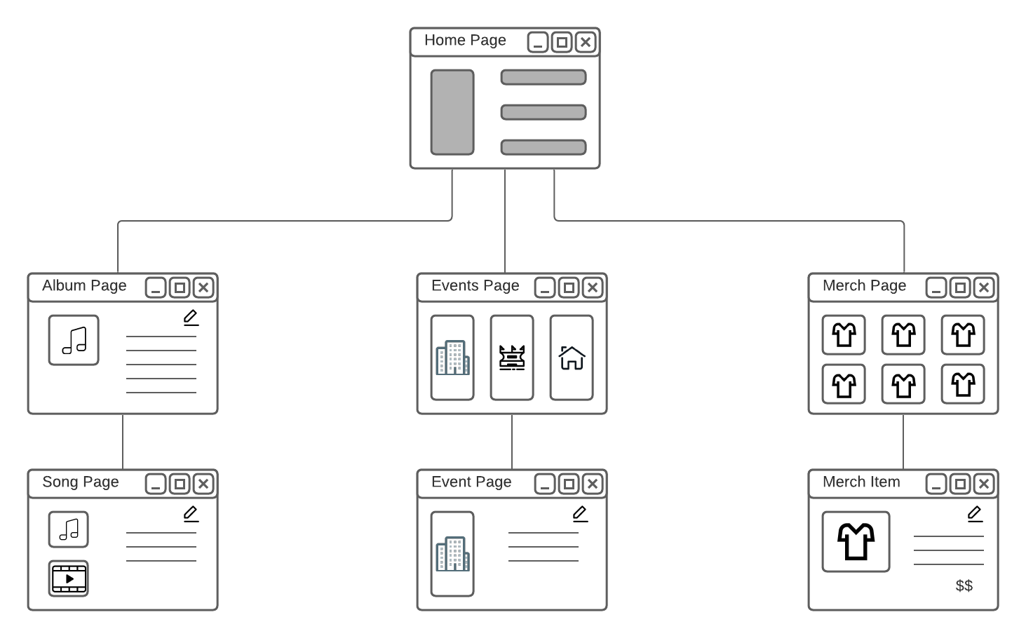
A sitemap can roughly correlate to the site’s navigation patterns. There is a clear entry point to the application, assuming the user is starting their journey with a clean slate. In our musician example, that can be a home page. From there the sitemap shows the pages they can navigate to, which can help inform the content of headers / footers / menus. Pages for albums, events, and merch are some prime examples. Sub-pages, like for an individual song in an album, are navigable from each of those main pages, and go as far down as the application allows. To be clear, this doesn’t show every link between every page; rather, it’s meant to show the direct relationships between child and parent pages in an attempt to provide structure to an application. That structure can then guide user behavior without limiting their possible actions.
Consider the example below, which shows the hierarchy for an app that our musician might create.

The structure of the application should be easy to follow. In this case, it’s clear that from the home page the musician can manage their albums, view all upcoming events, and get an overview on their current merchandise. Sub-pages exist to dive into individual items within those broader categories. While not explicitly outlined, they could theoretically hop from one page to another via direct links. For the purposes of a sitemap, this diagram is enough to get a feel for what pages exist in the app and how they relate to one another without getting into the specifics of layout and full content.
Route Maps: Engineering Detail on a Design Artifact
Sitemaps are often created by a designer or product manager (or both!), and given to the engineering team as a reference document along with wireframes and other more detailed mockups. They can have a long shelf-life as a “guiding light” to an app’s architecture and organization. However, rather than viewing it as a static asset, there’s room to go deeper and add technical context. I previously mentioned that a sitemap can roughly correlate to an app’s navigation pattern, and that’s where route maps come in. If you view each entity in your sitemap as a page, then each page can have a URL that allows the user to reach it. The URL can then keep the same hierarchy that both design and product envisioned, driving consistency across teams.
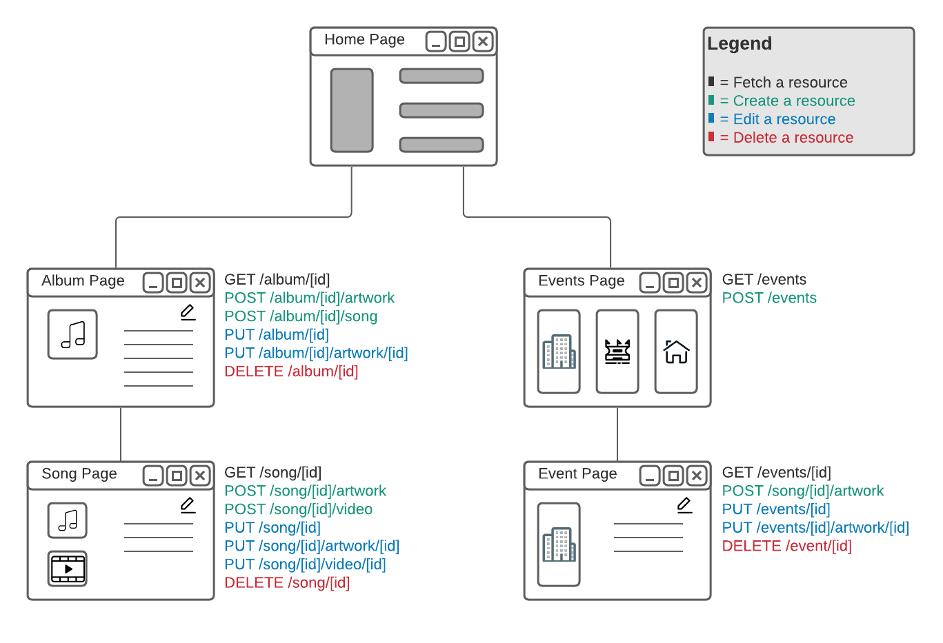
Taking it one step further, consider that each page has some expected actions / behaviors for a user to perform. In a REST-ful environment, those actions map to API calls allowing users to create / read / update / delete pieces of data. By adding lists of API calls for each page, it becomes immediately apparent what data is needed on each page. Keep it very simple: defining that a page needs to GET /albums, GET /albums/[id]/songs, and POST /cart makes it clear to all parties involved that the page needs to load albums, load the songs for an album, and create a cart. At no point did we define the exact payload structures. It’s just enough information to show the data requirements for those pages.
The example below expands part of the sitemap to a route map. Notice how managing albums requires more unique API calls when compared with managing events. That can lead to all sorts of questions: Does it make sense for one part of the app to be more complex than another? Would users prefer many simpler pages, or fewer more full-featured pages? What kind of time investment is needed to make all of this happen? Are there ways to reduce the number of API calls in favor of latency? Or can we parallelize calls by breaking down large API calls to multiple smaller ones?

Keep it Iterative
This kind of artifact thrives when there’s a back-and-forth between teams. By going through this exercise you may actually realize that a page is loading far too much data, which may negatively impact load times. An existing app may be structured differently from what the sitemap shows, and this is a chance for the engineering team to make that known back to the drawing board! On the flip side, engineering may not have the full understanding of what a page should do, and design can point out missing pieces of functionality. The cross-team feedback loop can be shortened by keeping it all within one document, getting you to a shared vision faster!
A sitemap is built on user feedback and prioritization, and guides platform structure in service of expected user behavior; a route map aims to define platform behavior and ensures that it can support the user behavior. This is just one simple way you can apply some engineering flavor to traditional service design tools. We’ll be following up soon with more ways you can bridge design and engineering to build more effective products!
Christian Ayala – OMG’er #148
Engineering Manager
Connect with me on LinkedIn
About OrderMyGear
OrderMyGear is an industry-leading sales tool, empowering dealers, distributors, decorators, and brands to create custom online pop-up stores to sell branded products and apparel. Since 2008, OMG has been on a mission to simplify the process of selling customized merchandise to groups and improve the ordering experience. With easy-to-use tools, comprehensive reporting, and unmatched support, the OMG platform powers online stores for over 3,000 clients generating more than $1 billion in online sales. Learn more at www.ordermygear.com.
Media Contact: Hayley Bell | hayley@ordermygear.com | 214-396-2110

